 By Rick Ryan, Envisn, Inc.
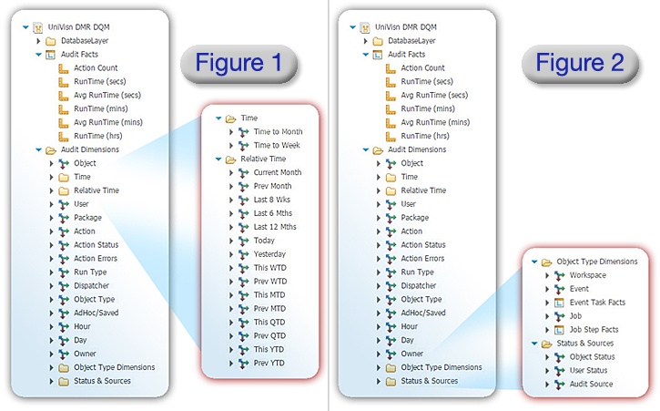
In our previous blog article, Creating a Framework Manager (FM) Model for Cognos Audit Data, we talked about work that we’ve recently done to create dynamically modeled relational data in the form of a FM Model. Our intent was to capture all available audit data and align it along key data dimensions and couple it with reference data from the actual Cognos environment. Doing this required at least a couple iterations. As we started to actually use the data to create the vision we wanted of UniVisn being reflective of a real world Cognos environment we needed to tweak some things like relative time periods, object type dimensions and status and sources.
The updated measures and dimension map for these can be seen in figures 1 and 2.
The next big step was to decide how to best utilize all of these data capabilities for a real world environment. We call this the presentation layer. And for this we decided to use Cognos Workspaces and create a series of dashboards covering some key areas. These included:
- User access stats
- Run time stats
- Activity stats
- Dispatcher stats
- Error stats
- Workspace stats
- Object stats
Examples of these can be seen in the figures below. Each of these Workspaces consists of a number of charts, graphs or reports that ideally reflect the real operational needs of an audit data dashboard in a Cognos environment. But if not, they can easily be changed, swapped out or modified for others that better fit specific needs around audit data. The great thing about Cognos Workspaces is that they’re flexible enough for you to get exactly what you need as long as you have the data needed to drive them. And they’re easy to work with.
Figure 3 shows user access statistics including the percentage of active users over the past three months along with a list report of users with no activity for a threshold number of days. It also shows the top users by package in the environment.
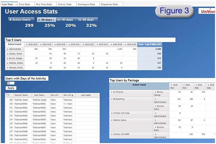
Figure 4 shows a list report and a number of charts displaying report run times along a number dimensions. These are examples showing the level of granularity one can get on run times when you have a broad set of dimensions with which to use the audit data.
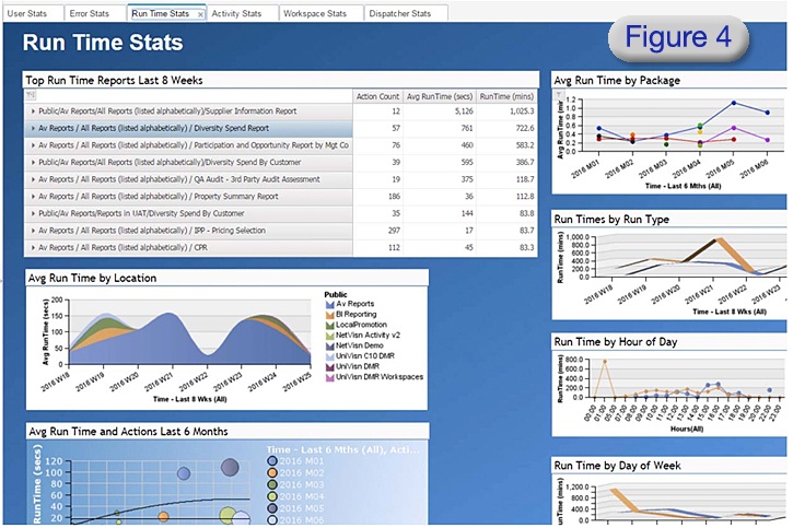
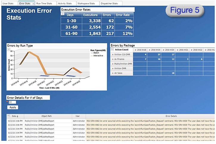
Figure 5 focuses on execution errors. There are a number of ways that these can be viewed and this example shows some common ones. Other examples might include looking at these by error detail type, time of day and object type.
Using Cognos Workspace is a perfect match for the Cognos audit data. It is highly flexible in terms of how the data can be utilized for maximum impact; charts, graphs and reports can be used together to create effective dashboards. With good user feedback you will be able to come up with the right mix of presentation types to make the dashboards that work best for your environment. And it’s yet another example of our ongoing effort in using Cognos to report on itself.
In our next blog we will cover how users can validate the accuracy of the numbers coming out of their Cognos audit data. This is important because if users don’t trust the numbers they won’t be used.
© Envisn, Inc. – 2016 - All rights reserved.


